Case Study: The Mindful Runner Visual Identity
Client:
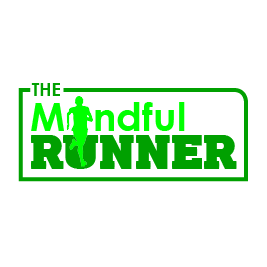
The Mindful Runner
The Project Overview
The Mindful Runner is a community-focused initiative designed to support mental well-being through physical activity. The goal was to create a brand that feels approachable, energetic, and supportive – moving away from the "high-performance/elite" aesthetic of traditional athletics and toward a "holistic/community" feel.
Colour Psychology: The Power of Green
The choice of a vibrant monochromatic green palette is central to the brand’s mission.
Mental Health Connection: Green is globally associated with growth, renewal, and tranquility. It has a calming effect on the nervous system, which aligns with the "mindful" aspect of the business.
The Great Outdoors: Since the group focuses on getting active, the green reflects nature and trail running, encouraging participants to step outside their domestic or office environments to clear their heads.
Vitality: The specific shade chosen is bright and high-contrast, ensuring the brand feels energetic and motivating rather than passive.
Typography and Visual Hierarchy
The logo utilises a "stacked" typographic approach to create a solid foundation.
The "RUNNER" Foundation: The word "RUNNER" is set in a heavy, bold, sans-serif typeface. This provides a sense of stability and strength, representing the physical "grounding" that exercise provides for mental health.
The "Mindful" Balance: "Mindful" is placed above, acting as the header. The contrast between the slightly lighter weight of the top text and the heavy base suggests that mindfulness sits "on top" of the activity – it is the guiding principle of the movement.
Iconography: The Human Element
Integrating the silhouette of a runner directly into the wordmark is a key "discovery" moment for the viewer.
Integrated Action: By replacing the "i" or nesting the runner within the letterforms, the design suggests that the person and the activity are one.
Forward Motion: The silhouette is captured in mid-stride, symbolising progress. In mental health, moving forward – no matter the pace – is a powerful metaphor for recovery and resilience.
Accessibility: The silhouette is a simple human form, not a professional sprinter. This makes the brand feel inclusive to people of all fitness levels.
The Container: Creating a Safe Space
The logo is encased in a minimalist, rounded rectangular frame.
Community & Belonging: The frame acts as a "container," symbolising the "place" you mentioned where people come together. It represents a safe, judgment-free zone.
Modern Professionalism: The frame gives the logo a "badge" feel, which works exceptionally well for social media profile pictures and potential merchandise like t-shirts or water bottles.
Summary of Impact
The final design successfully balances the sturdiness of a running club with the softness of a mental health retreat. It identifies "The Mindful Runner" not just as a workout group, but as a lifestyle choice centered on holistic health.